Tuesday, 31 January 2012

Film Poster Photoshoot Update

Shot showing Jordan pre-shoot
In order to complete our film poster for my design, we needed some original images to edit onto the poster. This included a shot of Jordan with his back facing the camera, with him looking menacingly over his shoulder. Firstly, we were careful to ensure continuity between the film and the poster so we asked Jordan to wear the costume he wears throughout the piece for the shoot (see the above shot). We also decided that lighting should be used effectively in the shot, with low key lighting casting a sinister shadow on the back of Jordan short and masking his facial expression.

This is the final shot of Jordan. As you can see, we made sure that the idea of violence is present through the use of blood on the shirt. However, I would prefer the blood to be more prominent in the image so I will ask Stephen if there are any possible effects on Photoshop to achieve this.


However, we had difficulty capturing the image of the broken glass. We did manage to produce a passable image - however, we'd like to try a photoshoot again to ensure the image is to a high standard.

Monday, 30 January 2012

'Killer Hangover' Review - First Draft

'The morning after the night before'. This is the tagline of the newly released short film titled Killer Hangover. Although the title and tagline instantly suggest a lack of innovation from the young team of film-makers, the narrative adopted in the ambitious piece transforms this well-worn genre into fresh canvas for the exploration of ideas on the silver screen. This is achieved through the team's enthusiasm to experiment with diverse influences, including Ratthe's short film sensation Lovefield and classic Hopkins' horror features.

In addition to the debutant director, Killer Hangover introduces the film world with fresh-faced actor, Jordan Oberdries, who plays the nameless young antagonist who wakes up to a smashed house, a splitting headache and stained carpets.... Oh, and the small issue of a dead girl on the kitchen floor. Immediately cast into stark panic, our subject anxiously seeks to not only piece together the fragmented events of last night but also protect himself from the ensuing condemnation that threatens to ensnare him at all points. However, the sting of the scorpion exists not in the safety of horror but in the creative narrative twist...

The piece hints at the team's potential, specifically in the technical aspects of film-making. One of the prominent appeals of the entire piece - even if only from a film-geek perspective - is Rory Harris' editing, with special care being taken to maximize the effect of each shot. The soundtrack is also skilfully crafted to supplement the visual aspect of the film, adding another stroke to the before-mentioned canvas.

However, though demonstrating a significant level of promise, Killer Hangover isn't without flaw. Oberdries' performance often lacks the ability to convince an audience, let alone instil the fear, anxiety and horror that the editing and soundtrack seek so desperately to establish. Although the rest of the piece seems to exude confidence and experience, the casting of Oberdries shows the team's Achilles heel - the ability to detect the right actor for the right role. In order to achieve the calibre of award-winning material this team is capable of, they must strive to overcome this weakness.

Despite this shortfall, Killer Hangover is a note-worthy experiment in the genre of horror by Neal and company, prompting the ability to produce a higher level of film in the future. As is expected for a first piece, it presents it's weakness in equal proportion to it's successes but, unlike the crowds of 'tried but failed' and 'maybe next time' films, Killer Hangover is a colourful Monet with the promise of a Picasso on the horizon. After all, a fresh canvas always seems to highlight the missed strokes more than those skillfully applied right?


Written by Marcus Pelham with proofing from Stephen Neal

Monday, 16 January 2012

Title Sequence Audience Feedback

Below are two versions of the title sequence; we are keen to discover which of the two appeals to our target audience more. In order to achieve this, each member of the group will release the footage on social network site Facebook and get people to vote on which one they prefer. We will then use the details of the response and decide which one is more effective from the feedback.


Version One:


Version Two:


UPDATE ON 24th JAN

Market research proved helpful in this editing decision; feedback from Facebook proved that our target audience preferred Version One, in addition to the narrative being clearer when the movie was introduced without the 'psyhcotic' jumpy text at the beginning. As a group, we have decided to follow the information from our audience and include Version One in our final piece.

Friday, 13 January 2012

Tagline Idea

Today, the issue of our film's tagline was discussed today. We had several suggestions, including 'Don't get smashed' and 'Who doesn't love a killer party?!'. However, the one that we have decided to pursue was 'The morning after the night before' as it links to the title of 'Killer Hangover' and would be a statement our target audience would be familiar with. It also establishes the original genre of horror whilst capturing the twist of a party.

Wednesday, 11 January 2012

Film Poster Analysis

For part of our coursework we have to create a poster for our short film. To do this we have to analyse some film posters to see what aspects make a good poster.

Hostel:

Narration-
-The title is in a larger font than the rest of the text to make it stand out, it is also written in a different font.
-The body in the floor is running along horizontally to the title and text, this is odd because most posters usually contain the protagonits in them. This is just a body cuffed to a chair.
- There is also a head in the bottom right of the screen. This is to give the impression that this man had been decapitated. This show's that the film is a horror and very sick.
-The red background and blood splatter suggests a dark bloody film that doesn't have a lot of brightness or happiness in. It is all about darkness and death.

Target Audience-
-Just from looking at the poster it is possible to see that this film is not for everyone. It looks like the sort of film a Saw fan would enjoy.
- Possibly young men from 20-35 would enjoy this film.
-The whole poster would attract a fan of horror movies.
- No reviews on the poster, this would cause some trouble with showing people what the film is like. But it is possible to work it out just from the poster.

Representation-
-First thought would be that it would appeal more to males, but as there is not much representation of either sex in this poster, it must be for both genres who have a taste for horror films.
-However the body and head are a mans, so it may appeal slightly more to men.

Genre-
-The dark red background and title written in blood suggests a very dark and bloody film.
- The blood splatter and decapitated body suggest a horror film.
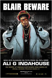


Ali G Indahouse:

Narration-
-The title is not the largest font on the poster, the tagline of "blair beware" is, this could be to catch a viewers attention.
-The picture of Ali G is obviously what the character thinks himself to look like, a rich pimp with smoking guns. To anyone who doesn't know about this character, then this would look like a poster to a serious gangster movie, not a comical spoof.
-The background shows the house of commons, this is to show that this place will have a big impact on the protagonist.
The white text really stands out from the dark background. This shows that we are supposed to pay more attention to this than anything else.

Target Audience-
-We can tell by the written text that this is a spoof film. The use of "da" instead of "the" mocks how gangsters stereotypically speak.
-This is a film for people who like comedy films.
-They also will probably be quite a young audience from about 15-25. Anyone older may not get the message from the film.
-This is a film that both genres should be able to enjoy.

Representation-
-It is obvious that Ali G is the protagonist. His posture and the fact that he is the only character on the poster proves this. He is holding the two guns up with no problem, this is to show his physical strength.
-He is wearing a white fur coat and this helps him stand out from the background.

Genre-
-It is a spoof comedy film.
-Fit for anyone who likes funny quotes and taglines.

Marcus Pelham Film Poster First Idea


First draft of poster design
Narrative: The narrative of the film is insinuated in the poster through the use of mise en scene. For example, by choosing the broken glass with blood on it as the prominent image (in size and through depth of field), the theme of violence is instantly communicated to the audience. However, it also establishes the link to the narrative 'twist' of our piece, with the connotations of a wine glass being that of parties and social events. This double-meaning offers depth to the poster, with the audience's expectations being undermined through the film and thus, developing the multiplicity of the objects and images used. The thriller-esque feel to the poster would be further developed through the desaturation of the image; this would provide a darker, harsher image associated with murder and violence, key ideas in our film. In contrast to the desaturation, we would draw more attention to the blood on the glass by increasing the colour of the blood to a bright, high colour red. This manipulation of where the audience's attention focuses first will help establish the narrative. So far, this poster has proven successful with early audience surveys showing that the narrative of our film is communicated clearly through the poster.


Representation: Although the main focus of the poster is the broken glass (and the insinuated violence), the audience will also be aware of the distorted character behind that image. This is important as it introduces the main character who, from the blood on his hand and the rip in his shirt, the audience assume is the antagonist. The distorted nature of the image restricts the audience's ability to understand his identity, creating audience intrigue and suspense. In a similar way to the glass, it will also reflect the twist of the narrative, with the haziness of the image reflecting the theme of alcohol and the main character's understanding of the previous night's events.


Genre: The genre suggested by the poster is thriller. This is achieved through the audience's inability to identify the character, creating enigma and suspense. The imagery of violent materials also helps convey this, with the glass and corkscrew (potentially a knife?) providing a sharp hint to the homicidal tendencies the character appears to display. In addition, the use of a single or simple image is a convention of thrillers, again as it restricts the audience's understanding of the narrative and creates intrigue.


Audience: We also believe that our target audience of youth would be attracted to this poster because of it's obvious theme of violence. This idea that 'the more shocking, the more people are intrigued' is evident in The Human Centipede's success and would be something we could try and emulate. It is also important to include review sources that appeal to a youth audience; for example, a 5 star review from The Times might be a great accolade but it will lack the effect that the same review but from MTV would offer.


Points of Development: title - design of logo? 
                                          tagline
                                          reviews - which sources?